The Leaning Giraffe
14 October 2015 | Inside Angama | Chris Gough Palmer
The story begins one Monday in April 2014, after receiving an email from someone named kate.fitzgerald.sa. In my experience, new business enquiries from personal Gmail accounts tend to go one of two places: nowhere, or into the trash. Being a Monday, and feeling optimistic, I followed up and we set a time to meet. Little did I know that this was the beginning of a remarkable working relationship, not only with kate.fitzgerald.sa, but the entire Angama family.
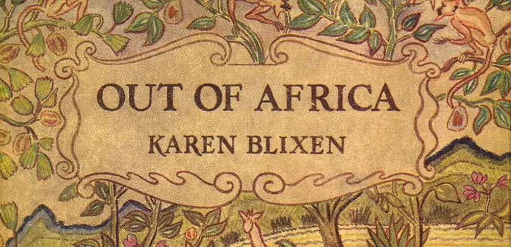
The brief for their new luxury safari company was unusually specific, unlike any we’d ever received. In fact, the brief was about 100 years in the making, initiated by the Danish author Baroness Karen von Blixen-Finecke when she moved to Kenya in 1913. Her memoir ‘Out of Africa’ set the scene for us; it painted the lyrical story behind the location of the Fitzgerald project in detail; at 416 pages, that’s quite a substantial brief.
Needless to say, The New Black team cheated and watched the movie.
Blixen’s description in her book of the geographical location was the narrative we were looking for; “Africa distilled up through six thousand feet like the strong and refined essence of a continent.” Their brand name Angama was spot on, not only unique and phonetically beautiful, but appropriately the Swahili word meaning ‘suspended in mid-air’. The scene was set, and now The New Black’s job, simply put, was to capture this grand story and vision, and to package it uniquely for the world. No pressure.
From the beginning we worked closely alongside the creative team: Silvio Rech, Lesley Carstens, Annemarie Meintjes and Lesley Fox. Taking prompts from this acclaimed team was seamless; from the fluid architectural drawings through to the choice of interior fittings and finishes, we had a focused direction with an array of inspirational cues.
The New Black worked initially to exemplify the personality of the brand, to identify what makes it unique in a category already swarming with luxury and bucket-list experiences. We realised that many 5-star safari lodges have a similar offering for the global guest. It’s relatively easy to please a sophisticated traveller coming from New York City or Shanghai in a remarkable environment like the Maasai Mara. What defines the next-level of luxury are truly unique and personal guest experiences. The mantra guiding the brand essence was that Angama needed to be authentic at every touch point.

Authenticity was to be the cornerstone of the brand. It helped develop the visual language and strategy for Angama – referencing not only Karen Blixen’s British East Africa but also current day Kenya: the contrasting colour palette true to vibrant Maasai tribal detailing; softer colonial tones of canvas and blush; textures of polished copper and raw wooden surfaces; patterning and graphic devices based on the Maasai shuka; and the massive animal migrations as seen from the lodge. Grids and layouts were inspired by wide open plains which is also echoed in the typographic style, beautifully summed up by yet another quote from Out of Africa “In the open air, amid the wide spaces that he loved, fearless and free to the end.”
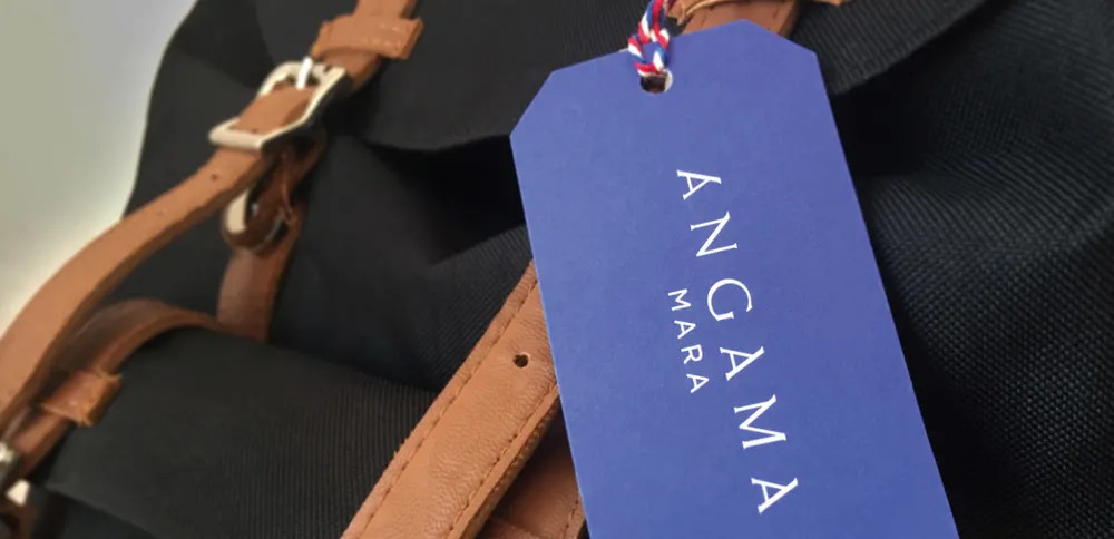
The brand structure was succinct: there was the master brand Angama, the lodge Angama Mara as the hero brand, the service brand Angama Safaris, and only later, the Angama Foundation was introduced to the family. Understanding this monolithic structure, a great deal of importance was placed on the Angama name, which became the focal point of the brand signature – the logo.
![]()
The brand name needed to be reflected in the logo: to tell the story of a lodge being ‘suspended in mid-air’. It needed to underpin the historical importance as well as the world’s curiosity with Africa; the spirit of the place, its people, flora and fauna. Luckily Angama is made up of handsome characters, with a particular importance and beautiful phonetic play on the letter ‘A’.
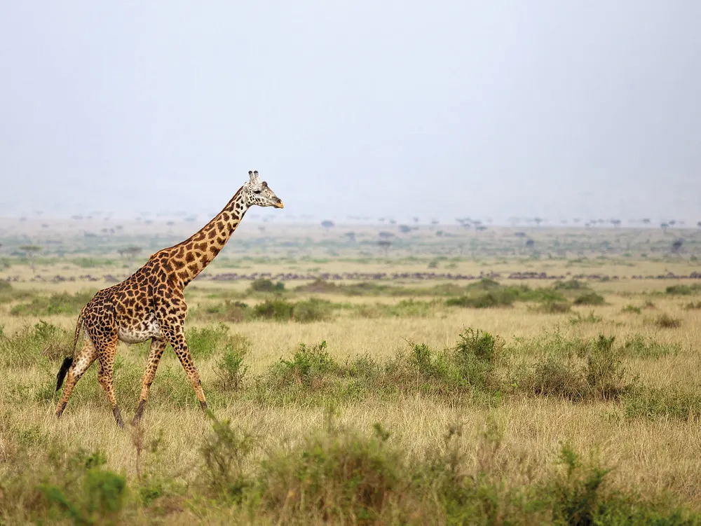
The deeper we researched, the more obvious certain visual cues revealed themselves, and the Angama wordmark took shape: architecturally the shape of the lodge’s tented suites suggested a semi-A-framed structure; the famous one-legged Maasai warrior stance; and the distinctive shape of a herd of giraffe on the plains. This imagery was strong and consistent, but the final design only really took shape when researching early 20th century explorers’ maps. Their incredible typography was not only decorative but also functional; contrasting intricate serifs, ornate flourishes and clean sans serif lettering. Having a particular fetish for typography, I happily explored this era in depth and fell in love with the classic typography of Fritz Helmute Ehmcke. As a self-taught German architect, illustrator and typographer he had a unconventional and structural view on lettering, often using an over-extended ascender allowing the serif head to stand proud. Ehmcke’s style immediately became the key reference to the meticulously crafted typography seen in the Angama wordmark. The giraffe leaning elegantly, the proud stance of the Maasai and a nod to the luxurious tented suites – all letters in union and generously spaced… suspended in mid air.
![]()
Branding Angama and creating its identity was an inspiring experience: a passionate client constantly challenging the often-antiquated safari concept; and bringing authenticity back to Kenya. After all ‘safari’ is Swahili for ‘journey’.
The moral of the story?
Don’t be too quick to judge unbranded email addresses which land in your inbox. It could very well be the start of a great African adventure.